Have you ever visited a website where you just couldn't find what you were looking for? Or encountered buttons so tiny they felt like an eye test? Or struggled to read content on your phone by constantly zooming in and out? These frustrating moments stem from two critical design failures: "usability" and "accessibility."
They sound similar, but each has its own focus:
Usability: Concerns "how well it works." Is the site's logic clear? Are the processes smooth? Can users easily achieve their goals (like making a purchase or finding information)?
Accessibility: This is about "whether it can be used." Is the color contrast sufficient? Can screen readers used by visually impaired individuals interpret the content? Can all functions be operated via keyboard?
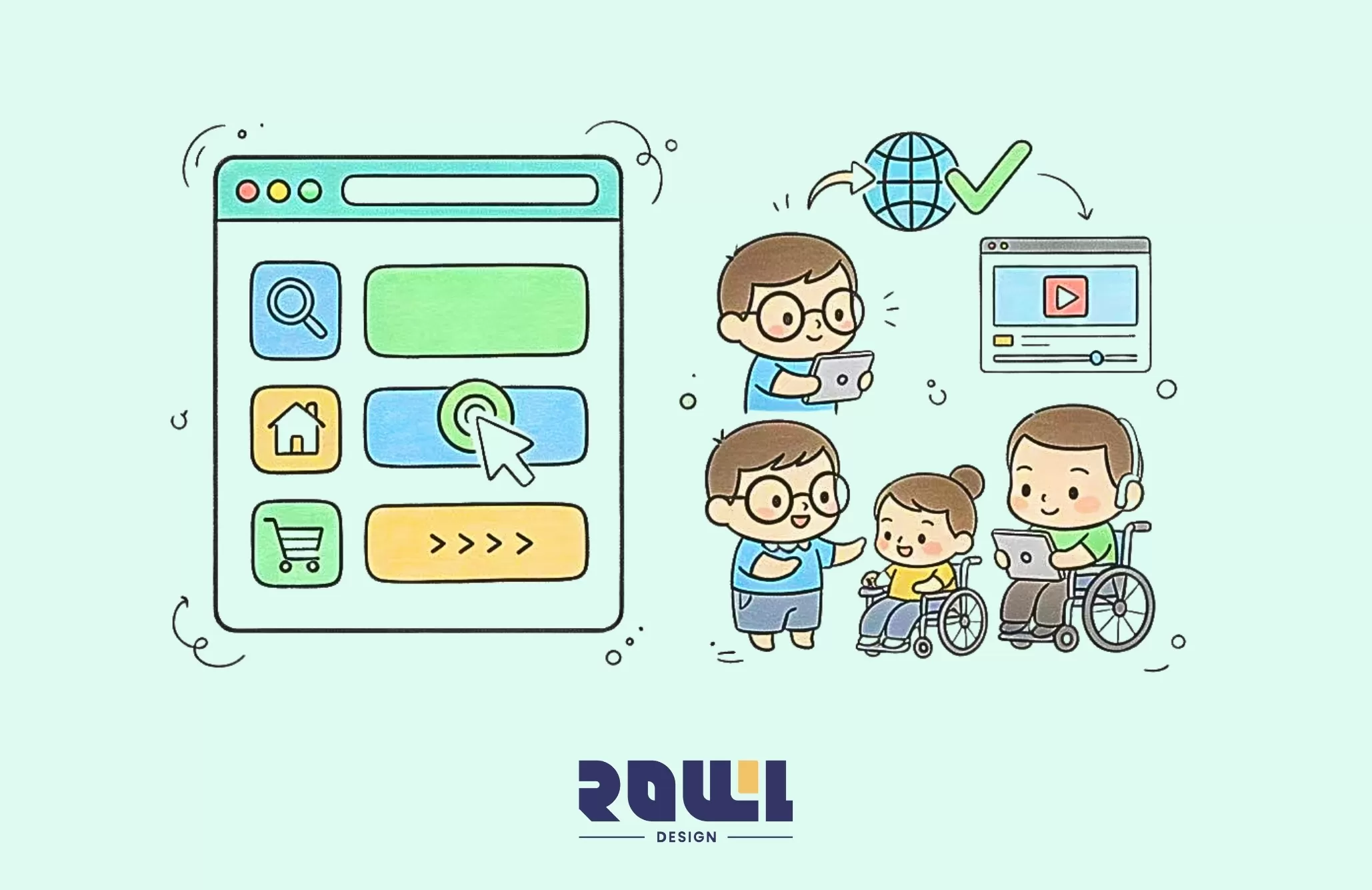
A good website isn't just about being user-friendly for the majority—it must ensure equal access for everyone, including users with diverse abilities. This isn't charity; it's a fundamental responsibility for modern businesses and a smart strategy to boost customer goodwill and conversion rates.
Step One: Turn "Intuition" into Design Principles
Imagine walking into a beautifully decorated store with a great atmosphere, but the merchandise is scattered everywhere, there are no price tags, and no staff in sight. Wouldn't you want to leave immediately?
The same principle applies to websites. If users can't figure out "where the buttons are" or "what to click next" within three seconds of landing, they'll leave. Moreover, Google will notice this high bounce rate, negatively impacting your search rankings.
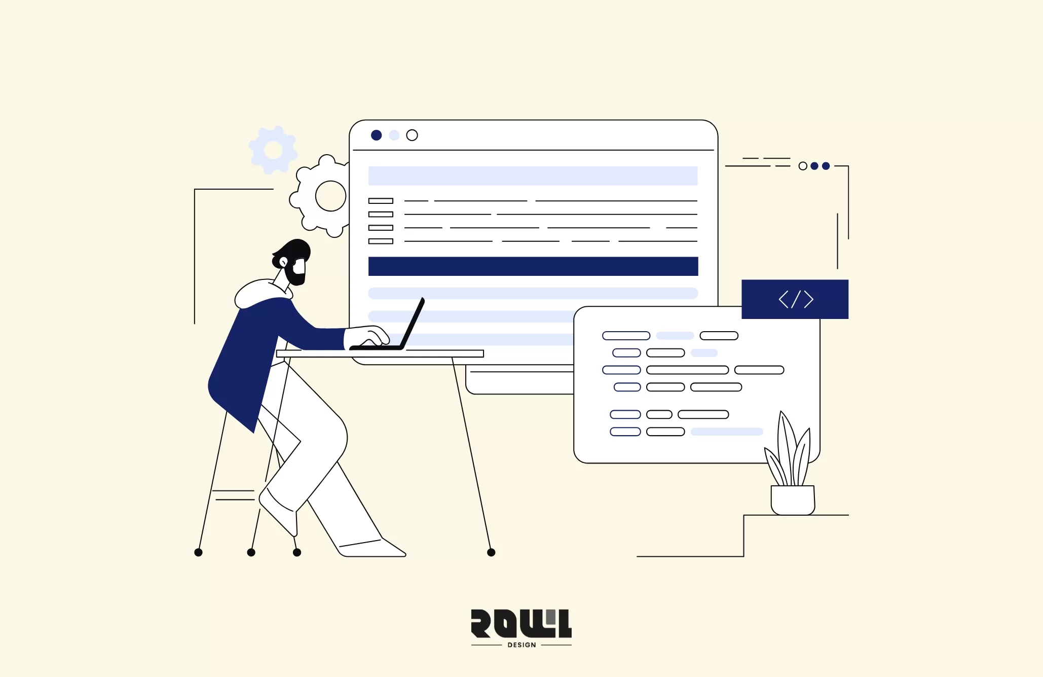
Therefore, website navigation design is a critical factor in usability. Users should effortlessly find the information they need without extensive searching. ROLLLL DESIGN recommends implementing clear, intuitive navigation structures with explicit labels and categories during website development.Our team designs optimal navigation solutions based on user needs and behavioral analysis, ensuring visitors can seamlessly transition from one page to another and enhancing the overall user experience.
Step 2: Design for Everyone—Practical Checklist for Accessibility
Here, "everyone" truly means everyone: seniors with impaired vision, friends with color blindness, users who rely solely on keyboard navigation, or those with slow internet connections.
1. Color and Contrast: More Than Aesthetics
"Light gray text on a white background" may look stylish, but for many it's practically invisible. Ensure contrast meets standards (WCAG AA level) to guarantee text readability. Never rely solely on color to convey meaning (e.g., "red indicates error")—always include icons or textual explanations.
2. Text and Images: Add "Captions" to Your Content
Every image needs alt text: Don't just write "image" as a placeholder. Provide a concise description of the image's content. This helps screen reader users "see" the image and is super beneficial for SEO—Google relies on this to understand image content.
Font size must be adjustable: Avoid hard-coding font sizes. Allow users to zoom in their browsers without causing layout issues.
3. Keyboard Navigation: Every Function Must Be "Within Reach"
Testing is simple: Disable your mouse and navigate your site using only the Tab key. Does focus move logically? Does it get stuck anywhere? This standard is crucial for users with disabilities or in certain situations.
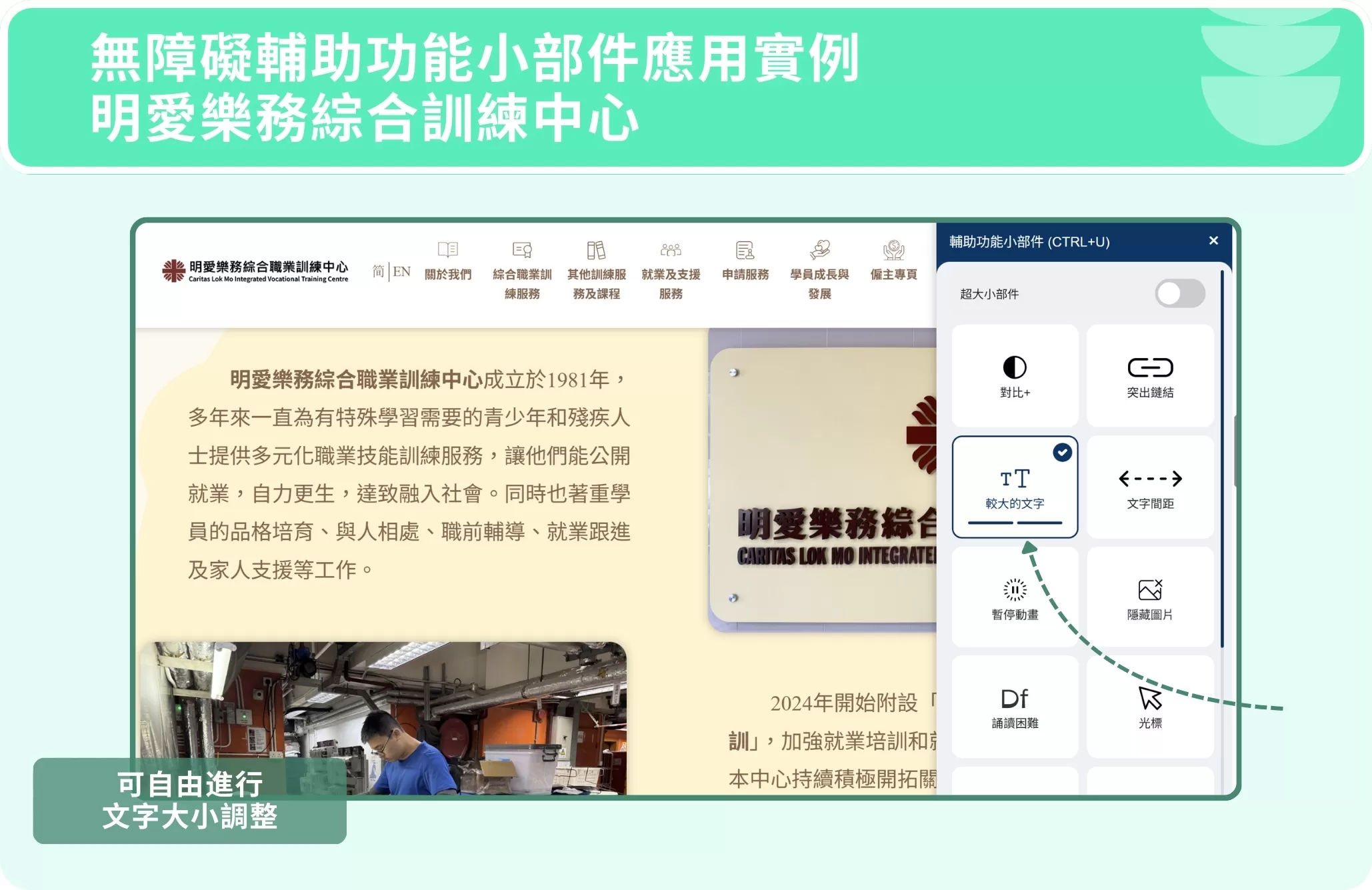
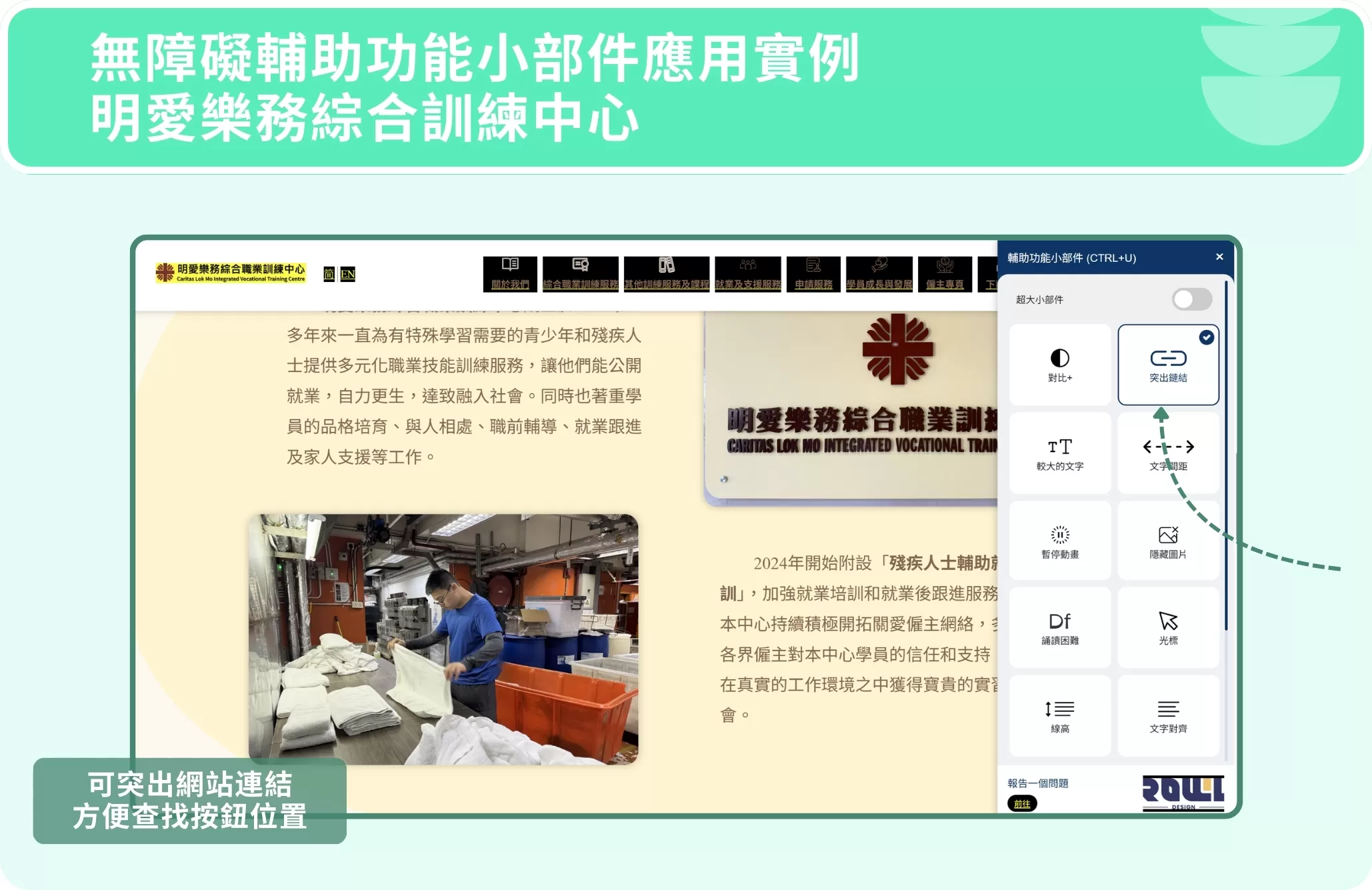
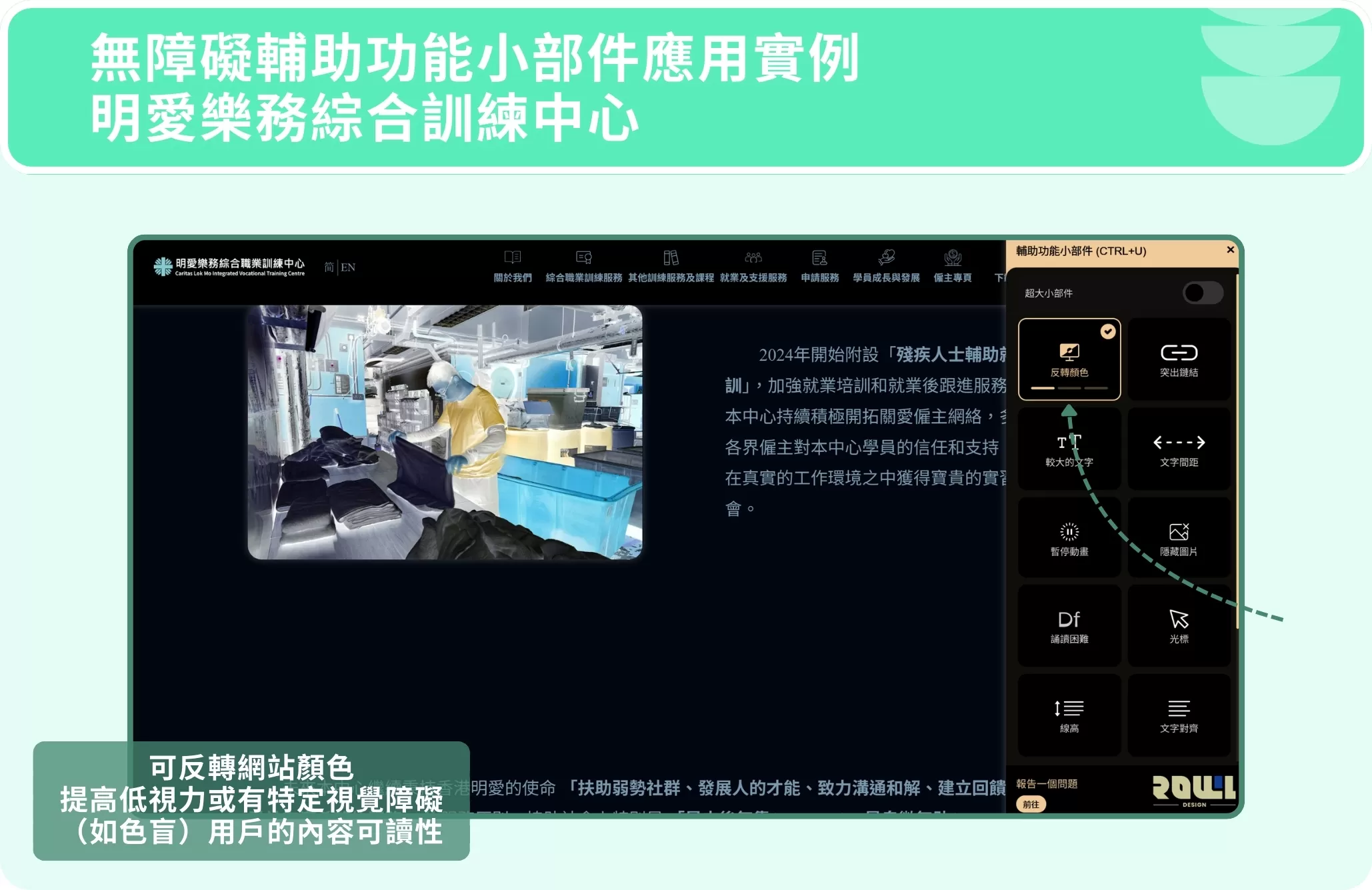
ROLLLL DESIGN, as a professional web design company, prioritizes accessibility in website development by adhering to WCAG (Web Content Accessibility Guidelines). We've developed a powerful "Accessibility Widget."Users can adjust font size, color contrast, spacing, and even hide animations with a single click. This provides a highly customizable browsing experience for those with visual, reading, or cognitive impairments, truly achieving information equality.
Step 3: Don't just guess—let real users tell you the answer
What we find user-friendly might be a disaster for others. The most effective approach? Conduct real usability testing.
You don't need a large group—5 to 8 target users are sufficient. Give them a few key tasks (e.g., "Find our contact information and schedule a consultation"), observe them closely, and note where they get stuck or feel confused. You'll uncover many blind spots you never imagined.
Conclusion
Good website design is invisible design. When a website truly achieves usability and accessibility, users don't notice it.They simply think, "Hmm, I found what I needed quickly, the process flowed smoothly, and the information was clear." For users who rely on accessibility features, this website represents respect and inclusion. It's not just about ticking off a technical checklist; it's a shift in design thinking—from "what we want to showcase" to "what users need."
As a professional web design agency, ROLLLL DESIGN achieves these goals through intuitive navigation design and adherence to accessibility guidelines. This not only elevates brand image but also attracts more potential customers. If you're seeking a company that delivers high-quality web design services, we're always happy to help!
2026 Corporate Website Redesign Guide: What’s the Difference Between a Custom-Designed Website and a Traditional Template-Based Website?
Does your business need a website redesign? This article breaks down the latest web design standards for 2026 and provides a practical roadmap. Learn why partnering with a professional web design agency that offers custom system development can help you move beyond cookie-cutter website packages and build a high-conversion digital asset....

A Beginner's Guide to System Development: An Overview of the 7 Key Processes, Common Development Models, and Cost Components
What is system development? This article explains the definitions of system development and the SDLC, outlines the seven major system development processes, introduces two key system development models and common cost items, and answers three frequently asked questions about system development. At the end of the article, we also recommend custom system development vendors to help you find the right development solution!...
Customization , System Development
Practical Website Development: A Complete Roadmap for Building an SEO-Friendly Website from Scratch
For many Hong Kong businesses, website development is often viewed as a simple process of putting a company profile online. However, if the website cannot be found by potential customers in Google search results, this investment is essentially wasted. True professional development requires embedding SEO into every aspect of the website before writing a single line of code. According to the 2026 SEO algorithm update report, websites with poor initial architecture will require...
Website Development , SEO-Friendly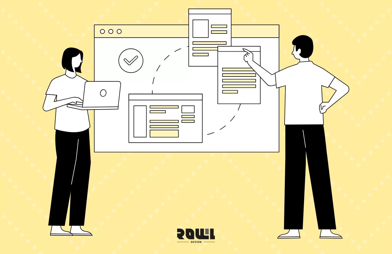
Web Design Tutorial: 5 Practical Layout Tips and Website Design Examples to Boost User Retention
When users click through to your website, the first 3 to 5 seconds often determine whether they stay or leave. Excellent website layout design is not merely an aesthetic arrangement; it is a business strategy that guides users’ attention, reduces bounce rates, and ultimately drives conversions. For businesses seeking a professional web design agency, understanding the underlying logic of layout design is key to ensuring a strong return on investment. According to a 2026 study of Hong Kong’s B2B and B2C ...
Web Design , UI DesignHelp you solve company IT transformation challenges,
All types of functional websites/Apps/systems can be created!
If you have any production needs, please contact us,
We will provide free consultation for your needs.
- # Good service ≠ More expensive
- # Professional IT team, improve website effectiveness
- # Proper planning, tailor-made IT solutions
Popular Articles

From Idea to App Store: Your 2026 App Development Roadmap
10211
The 2026 Hong Kong Digital Marketing Playbook: Your Guide to Outpacing the Competition
5046
Don't let an outdated website make your company seem old-fashioned to customers
2878
A Warning Sign: The Critical Importance of Updating Your Website Content
2805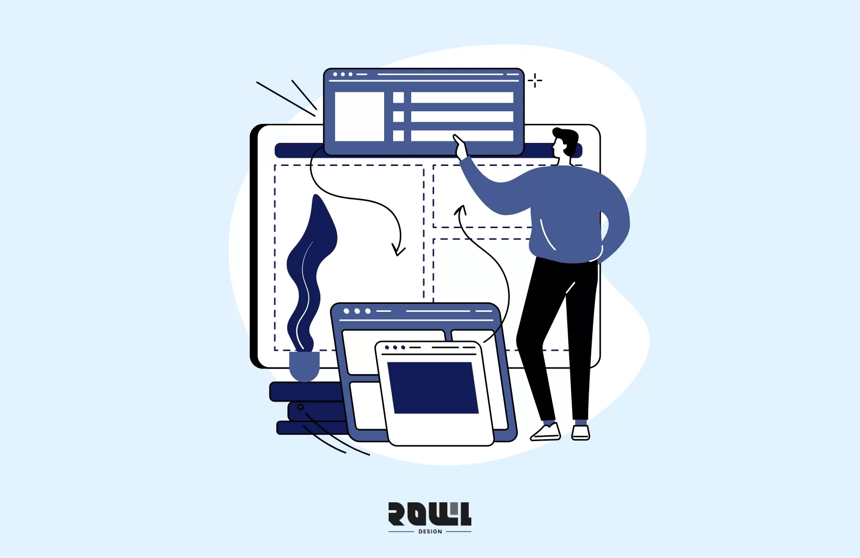
Beyond WordPress: Understanding What Truly Defines an Enterprise CMS
2802