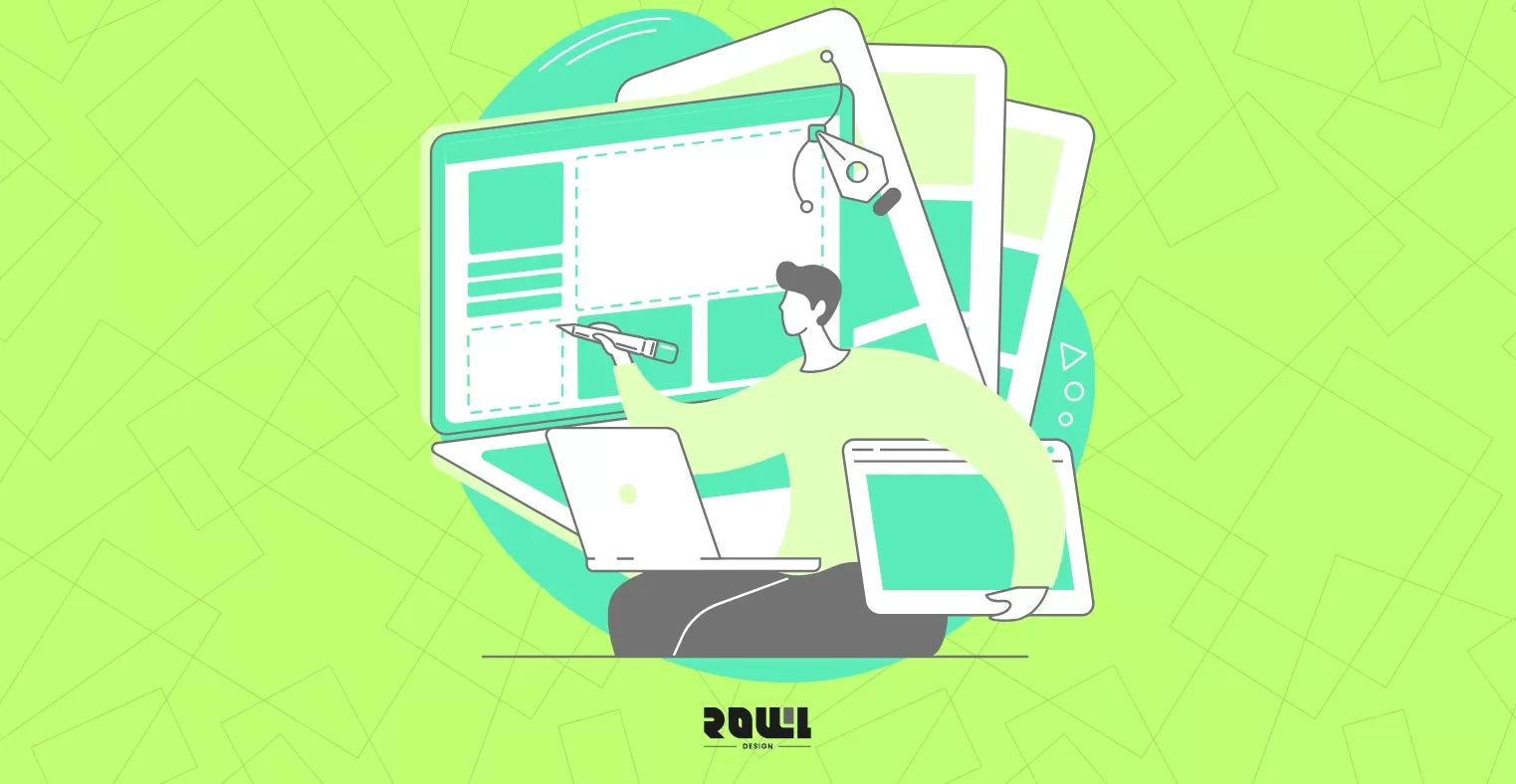
Have you ever had this experience?
You meticulously tweak your graphic design countless times on the computer screen—colors rich, details perfect. But when you receive the printed product, you're stunned—colors are dull and lifeless, edges are cropped off, or black areas appear grayish and washed out.
Don't be discouraged—it's not your design at fault. Screens and paper operate in entirely different worlds. At ROLLLL DESIGN, we're not just a web design agency; we also guide clients through bringing their offline print materials to life.
Today, we'll share a few essential basics to help you avoid common beginner pitfalls and ensure your hard work shines perfectly.
1. Color Modes: The Parallel Universes of RGB and CMYK
This is the root of all problems and the most crucial first lesson.
RGB: The language of screens. It blends red, green, and blue light to produce vibrant, luminous colors. Your computer and phone screens use this mode.
CMYK: The language of print. Created by layering four ink colors—Cyan, Magenta, Yellow, and Black (Key). It produces the reflective sheen of ink on paper.
Key Action:
When starting a print design, set your file directly to CMYK mode.
If you design in RGB mode, those dazzling blues and bright greens on your screen will appear dull and lifeless when printed, because ink simply cannot reproduce that luminous quality.
A metaphor: RGB is like drawing with a flashlight in a dark room—colors are "light sources." CMYK is like drawing with colored ink on white paper—colors are "reflective surfaces." They are fundamentally different.
2. Resolution: Don't let your images print as "pixels"
An image that looks sharp on screen doesn't guarantee print sharpness. Screen displays only require 72-150 DPI, but printing demands at least 300 DPI.
DPI: The number of dots per inch. Higher dot counts yield finer details.
Common Mistake:
Directly downloading low-resolution images (typically 72 DPI) from websites for printing results in blurry, pixelated output.
Key Action:
Ensure images provided to printers meet both size and resolution requirements of 300 DPI. Enlarging low-resolution images is ineffective and only makes graininess more apparent.
3. Bleed and Trim: Don't let crucial content get "cut off"
This is a concept unique to physical printing and the step most beginners overlook, leading to disastrous results.
What is bleed? It's the extra area (typically 3mm on each side) reserved around the design edges. This area gets trimmed off during final cutting.
Why is it necessary? Mass paper sheets undergo mechanical trimming after printing, which may introduce minute errors. Adding bleed ensures that even if trimming is slightly off-center, no awkward white edges appear on the finished product's border.
Key steps:
When creating the file, set the canvas size directly to "final size + 3mm bleed on each side."
Ensure all backgrounds or solid color blocks requiring "full bleed" extend precisely to the bleed line.
Ensure all critical text, icons, and logos are positioned at least 3-5mm away from the finished edge for absolute safety.
4. The Mystery of Special Black: Why Your Black Isn't "Black" Enough
On screen, black is #000000. However, in print, using pure black (K100) for large areas often results in a dark gray finish lacking richness. Uneven ink coverage may even reveal white spots.
Professional approach: Use "rich black."
Example: C50 M50 Y50 K100. Adding specific proportions of cyan, magenta, and yellow to pure black makes the black appear more saturated and solid on paper, preventing uneven printing issues.
Key Action:
When designing, set large black areas to a rich black composed of four-color overprinting instead of plain K100.
5. Know Your "Canvas": Paper and Finishing Techniques Define Texture
Choosing paper and post-processing techniques is like selecting frames and paints for your design—it fundamentally transforms the finished piece's character.
Paper Types:
From smooth glossy coated paper to warm, soft uncoated paper and textured specialty papers—each offers distinct tactile and color rendering effects.
Post-Processing Techniques:
1. Foil Stamping (Gold/Silver): Adds localized metallic luster for enhanced luxury. Note: Fine lines or fonts may yield poor results.
2. Die-cutting: Creates custom shapes through precision cutting.
3. Gloss/Matte Coating: Protects ink while imparting a glossy or matte finish.
Key Recommendations:
If uncertain, always request a proof from the printer before bulk production. Physically handling paper samples and inspecting the finish is the best way to avoid discrepancies.
Let professional partners become your "printing translators"
Printing is an ancient craft blending physics, chemistry, and visual artistry. A gap exists between digital designers and printing presses—one that requires "translation." Our role is to serve as your most reliable translator and gatekeeper.
At ROLLLL DESIGN, our graphic design services extend beyond visual creation to encompass a full advisory process from design to final delivery. We
know how to prepare print-ready files and recommend the most suitable paper stocks and techniques based on your design goals, ensuring your screen-based creativity translates 100% into the tangible delight you hold in your hands.
If you have important business cards, flyers, brochures, or packaging to produce but feel unfamiliar or anxious about printing, bring your ideas to the ROLLLL DESIGN team. Let us use our expertise to craft a flawless front for your brand—both online and offline.
The best design is the kind that catches your eye on screen and feels so good in your hands you won't want to put it down.
2026 Corporate Website Redesign Guide: What’s the Difference Between a Custom-Designed Website and a Traditional Template-Based Website?
Does your business need a website redesign? This article breaks down the latest web design standards for 2026 and provides a practical roadmap. Learn why partnering with a professional web design agency that offers custom system development can help you move beyond cookie-cutter website packages and build a high-conversion digital asset....

A Beginner's Guide to System Development: An Overview of the 7 Key Processes, Common Development Models, and Cost Components
What is system development? This article explains the definitions of system development and the SDLC, outlines the seven major system development processes, introduces two key system development models and common cost items, and answers three frequently asked questions about system development. At the end of the article, we also recommend custom system development vendors to help you find the right development solution!...
Customization , System Development
Practical Website Development: A Complete Roadmap for Building an SEO-Friendly Website from Scratch
For many Hong Kong businesses, website development is often viewed as a simple process of putting a company profile online. However, if the website cannot be found by potential customers in Google search results, this investment is essentially wasted. True professional development requires embedding SEO into every aspect of the website before writing a single line of code. According to the 2026 SEO algorithm update report, websites with poor initial architecture will require...
Website Development , SEO-Friendly
Web Design Tutorial: 5 Practical Layout Tips and Website Design Examples to Boost User Retention
When users click through to your website, the first 3 to 5 seconds often determine whether they stay or leave. Excellent website layout design is not merely an aesthetic arrangement; it is a business strategy that guides users’ attention, reduces bounce rates, and ultimately drives conversions. For businesses seeking a professional web design agency, understanding the underlying logic of layout design is key to ensuring a strong return on investment. According to a 2026 study of Hong Kong’s B2B and B2C ...
Web Design , UI DesignHelp you solve company IT transformation challenges,
All types of functional websites/Apps/systems can be created!
If you have any production needs, please contact us,
We will provide free consultation for your needs.
- # Good service ≠ More expensive
- # Professional IT team, improve website effectiveness
- # Proper planning, tailor-made IT solutions
Popular Articles

From Idea to App Store: Your 2026 App Development Roadmap
10211
The 2026 Hong Kong Digital Marketing Playbook: Your Guide to Outpacing the Competition
5046
Don't let an outdated website make your company seem old-fashioned to customers
2878
A Warning Sign: The Critical Importance of Updating Your Website Content
2805
Beyond WordPress: Understanding What Truly Defines an Enterprise CMS
2802