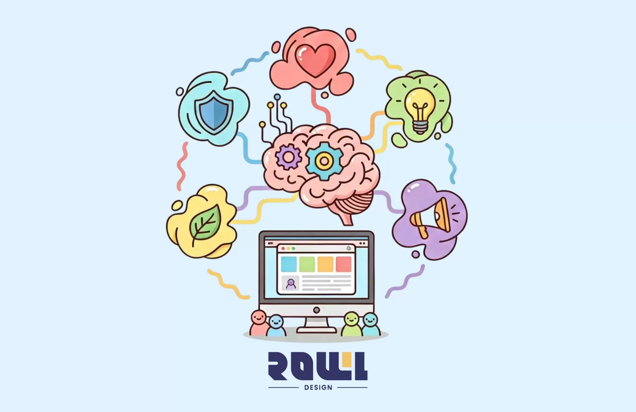
Have you ever had this experience? You click into a website, and before you've even looked closely at the content, you inexplicably feel it's "reliable," or "vibrant," or even "a bit pricey"?
This isn't mysticism. Color—that visual signal we absorb the moment we open our eyes each day—actually begins bombarding our brains from the very first second, triggering emotions and even directly influencing decisions.
Why do so many tech companies favor blue? Why are promotional pages often a sea of red? Behind it all lies the magic of color psychology at work in web design. Today, we'll explore how to turn this "language of color" into your website's most powerful silent salesperson.
In web design, choosing colors is never as simple as "the boss likes green, so we use green." Each color acts like a button—press it, and it activates a set of fixed emotions and associations in the user's mind.
1. Blue: The Ambassador of Trust and Professionalism
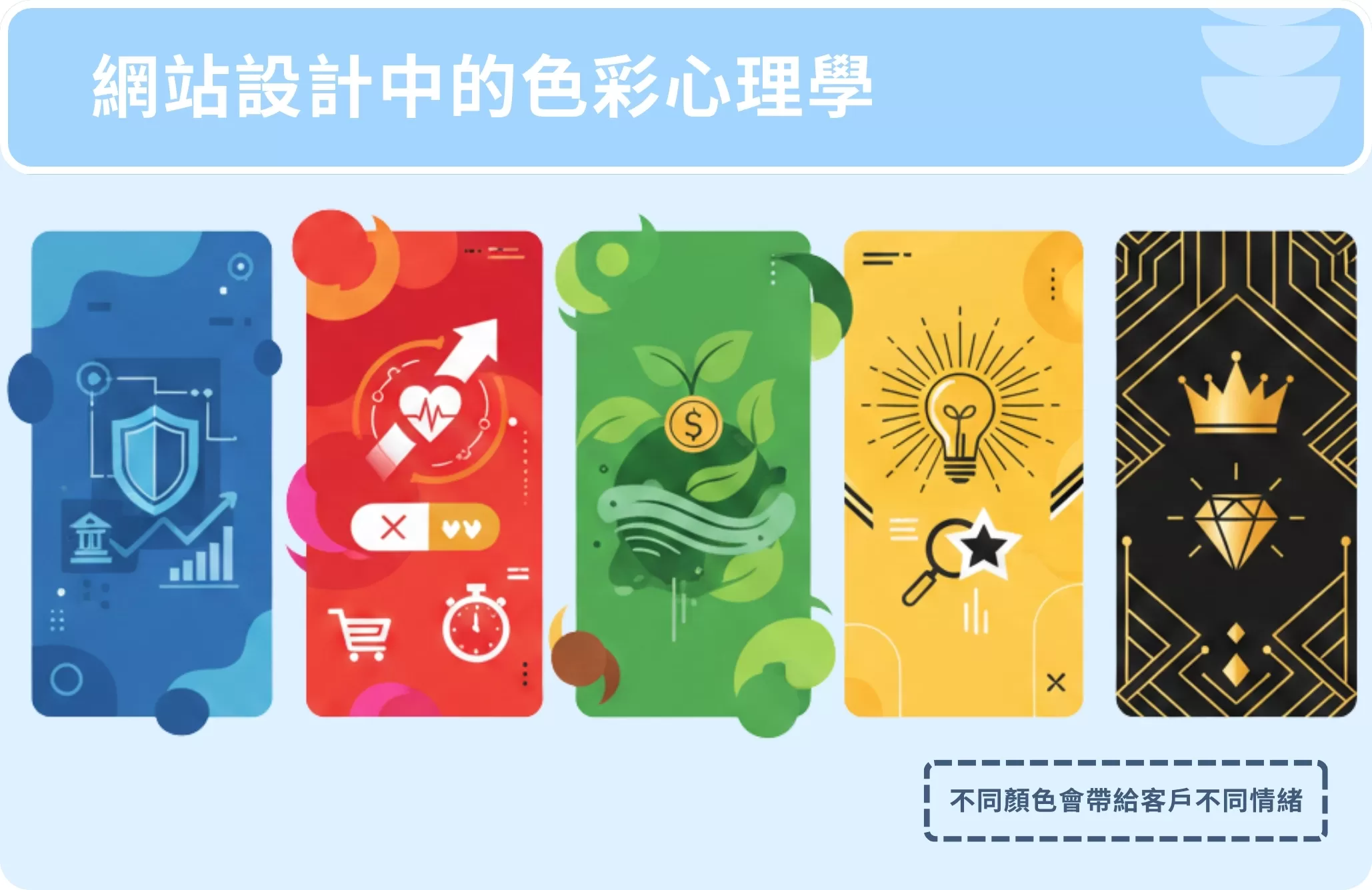
What comes to mind when you see blue? The vast sky? The steady ocean? Precisely because of this, blue has become synonymous with security, trust, and professionalism.Financial institutions (banks, insurance companies), tech firms (especially B2B software or web design agencies like ROLLLL DESIGN), and similar businesses favor it because it subtly establishes authority. But be cautious—too much or overly cool blues can feel "cold" and impersonal.
2. Red: Catalyst for Action and Passion
Red is the most intense color. It instantly grabs attention, quickens the pulse, and is the classic signal for "immediate action." That's why "Buy Now" buttons and limited-time discount labels often use red. It also represents passion and energy, making it ideal for food and beverage, entertainment, or youth-oriented brands.Yet it's a double-edged sword—overuse can appear aggressive or even threatening, making it unsuitable for brands conveying tranquility (like health and wellness).
3. Green: The Embrace of Growth and Reassurance
Natural, fresh, relaxing, growth... these positive associations are deeply linked to green. It's the go-to color for eco-friendly, organic, and health industries, and in FinTech, it conveys the image of "wealth growth." Green is easy on the eyes, making it ideal for websites where users need to read for extended periods.
4. Yellow: Optimism and Spotlight Attention
Like the sun, yellow evokes feelings of joy, optimism, and innovation. It effectively captures attention (hence its use on taxis) and is often employed to highlight key information. However, large areas of bright yellow can cause visual fatigue and may carry subtextual "warning" connotations, requiring careful proportioning.
5. Black and Gold: The Double-Edged Sword of Luxury and Minimalism
Black represents classic elegance, strength, and luxury; gold symbolizes success, quality, and preciousness. Their combination is a classic formula for premium brands, luxury goods, and high-end tech products, instantly creating an "exclusive and distinguished" atmosphere. The key lies in negative space and texture presentation; otherwise, it can easily appear oppressive or tacky.
Don't just choose colors you "like"; select an "effective" color strategy. Understanding color personalities is one thing; knowing how to combine them is the real challenge.
A well-executed website color scheme typically consists of three roles:
Primary Color (approx. 60%): Represents the brand's core personality and sets the website's foundation.
Accent color (approx. 30%): Complements the primary color, adds visual depth, and is used for secondary buttons, headings, etc.
Accent color (about 10%): The most eye-catching hue, specifically used to guide attention and prompt action (like CTA buttons).
More importantly, color choices must uphold accessibility commitments. Insufficient contrast not only hinders those with visual impairments but also impairs readability for everyone under bright lighting. A truly professional website design ensures text-to-background contrast meets WCAG standards—a fundamental respect for all users and a hallmark of professionalism.
From Theory to Practice: Your Website Color Checklist
1. Does your primary color align with your brand personality? (Is it tech-inspired blue or family-friendly orange?)
2. Are key action buttons visually highlighted? Can users instantly identify where to click next?
3. Does your overall palette exceed three primary colors? Too many colors resemble a spilled paint palette, causing visual clutter.
4. Have you conducted a "grayscale test"? When converted to black and white, does the information hierarchy remain clear? If everything blends together, you're relying too heavily on color to convey structure.
5. Have you considered colorblind users? Avoid relying solely on red-green contrast to indicate success/failure or critical information (e.g., form error alerts). Always include icons or text alternatives.
Conclusion
In summary, color psychology plays a crucial role in website design. Through thoughtful color choices, businesses can enhance their brand image, improve user experience, and account for cultural differences. As a professional web design company, ROLLLL DESIGN is dedicated to applying color psychology in our designs to create engaging and effective websites. If you're seeking high-quality web design services, feel free to contact us anytime!
2026 Corporate Website Redesign Guide: What’s the Difference Between a Custom-Designed Website and a Traditional Template-Based Website?
Does your business need a website redesign? This article breaks down the latest web design standards for 2026 and provides a practical roadmap. Learn why partnering with a professional web design agency that offers custom system development can help you move beyond cookie-cutter website packages and build a high-conversion digital asset....

A Beginner's Guide to System Development: An Overview of the 7 Key Processes, Common Development Models, and Cost Components
What is system development? This article explains the definitions of system development and the SDLC, outlines the seven major system development processes, introduces two key system development models and common cost items, and answers three frequently asked questions about system development. At the end of the article, we also recommend custom system development vendors to help you find the right development solution!...
Customization , System Development
Practical Website Development: A Complete Roadmap for Building an SEO-Friendly Website from Scratch
For many Hong Kong businesses, website development is often viewed as a simple process of putting a company profile online. However, if the website cannot be found by potential customers in Google search results, this investment is essentially wasted. True professional development requires embedding SEO into every aspect of the website before writing a single line of code. According to the 2026 SEO algorithm update report, websites with poor initial architecture will require...
Website Development , SEO-Friendly
Web Design Tutorial: 5 Practical Layout Tips and Website Design Examples to Boost User Retention
When users click through to your website, the first 3 to 5 seconds often determine whether they stay or leave. Excellent website layout design is not merely an aesthetic arrangement; it is a business strategy that guides users’ attention, reduces bounce rates, and ultimately drives conversions. For businesses seeking a professional web design agency, understanding the underlying logic of layout design is key to ensuring a strong return on investment. According to a 2026 study of Hong Kong’s B2B and B2C ...
Web Design , UI DesignHelp you solve company IT transformation challenges,
All types of functional websites/Apps/systems can be created!
If you have any production needs, please contact us,
We will provide free consultation for your needs.
- # Good service ≠ More expensive
- # Professional IT team, improve website effectiveness
- # Proper planning, tailor-made IT solutions
Popular Articles
From Idea to App Store: Your 2026 App Development Roadmap
10211
The 2026 Hong Kong Digital Marketing Playbook: Your Guide to Outpacing the Competition
5046
Don't let an outdated website make your company seem old-fashioned to customers
2878
A Warning Sign: The Critical Importance of Updating Your Website Content
2805
Beyond WordPress: Understanding What Truly Defines an Enterprise CMS
2802